Color can transform design, evoke emotions, and communicate messages in ways words cannot. For graphic designers, selecting the right color palette is crucial, especially when aiming to capture the vibrant and invigorating essence of tropical environments. In this blog post, we’ll explore the top 12 tropical color palettes that are perfect for various graphic design projects, providing you with the ultimate graphic design inspiration. We’ll dive into color theory and share creative design tips to help you utilize these palettes effectively in your projects.
Understanding Tropical Color Palettes
Tropical color palettes are inspired by the natural elements of tropical landscapes—think lush greenery, bright flowers, deep blues of the ocean, and the vibrant hues of the sunset. These palettes are characterized by bright, saturated colors that can invigorate any design with a lively, energetic vibe. But understanding how to use them effectively requires a bit of color theory knowledge.
1. The Basics of Color Harmony
Color harmony involves combining colors in a way that is pleasing to the eye. For tropical palettes, this often means balancing vivid colors with more subdued or complementary shades to create a visually engaging and effective design.
2. The Impact of Color Psychology
Colors not only beautify a design but also evoke specific psychological responses. For instance, blue can evoke feelings of calmness and trust, while red might stimulate energy and urgency. Using tropical colors strategically can enhance the intended impact of your design.
Top 12 Tropical Color Palettes
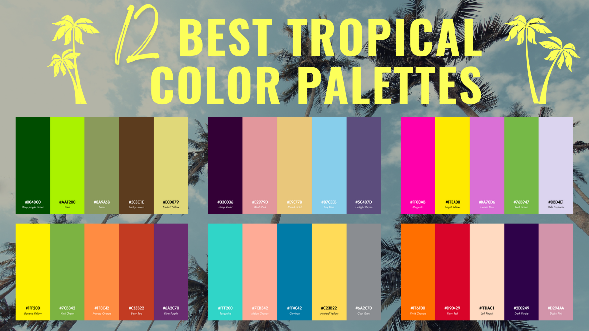
Palette 1: Lush Greenery
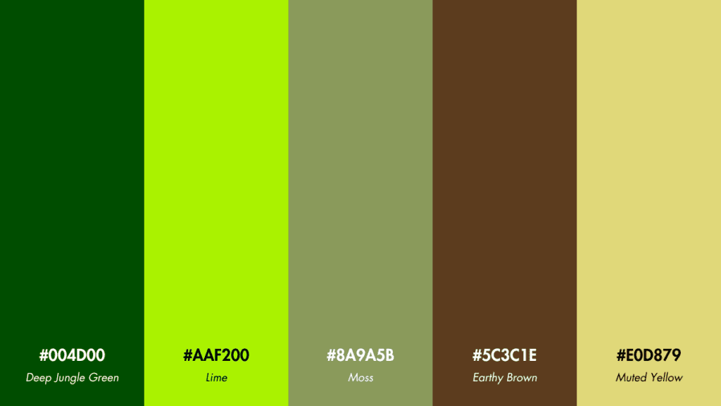
- Deep Jungle Green: #004d00
- Lime: #aaf200
- Moss: #8a9a5b
- Earthy Brown: #5c3c1e
- Muted Yellow: #e0d879
Usage Tips: This palette works well for nature-related themes, emphasizing growth and vitality. It’s ideal for businesses focused on sustainability and eco-friendly products.
Palette 2: Sunset Glow
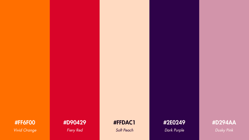
- Vivid Orange: #ff6f00
- Fiery Red: #d90429
- Soft Peach: #ffdac1
- Dark Purple: #2e0249
- Dusky Pink: #d294aa
Usage Tips: Use this vibrant palette for projects that require a dynamic and energetic feel. It’s perfect for promotional materials for festivals or lively social events.
Palette 3: Ocean Depths
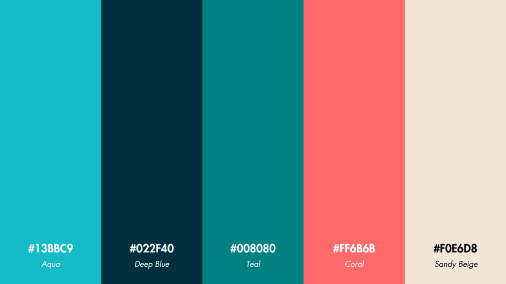
- Aqua: #13bbc9
- Deep Blue: #022f40
- Teal: #008080
- Coral: #ff6b6b
- Sandy Beige: #f0e6d8
Usage Tips: Suited for designs that aim to evoke a sense of calm and relaxation. Ideal for branding wellness products or creating serene app interfaces.
Palette 4: Floral Explosion
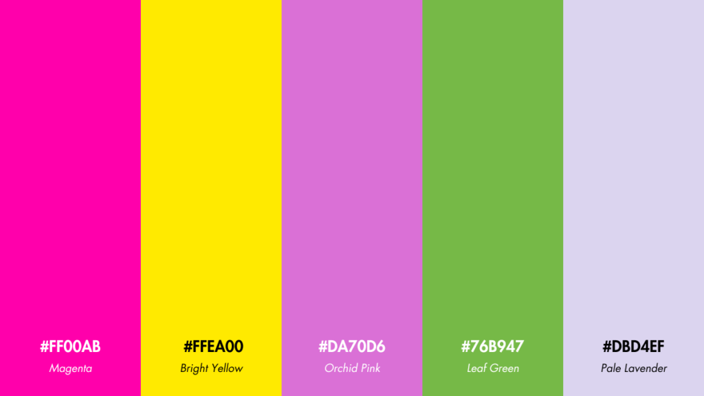
- Magenta: #ff00ab
- Bright Yellow: #ffea00
- Orchid Pink: #da70d6
- Leaf Green: #76b947
- Pale Lavender: #dbd4ef
Usage Tips: This bold and vivid palette can be used to attract attention in marketing materials, especially for seasonal promotions or fashion retail.
Palette 5: Tropical Fruits
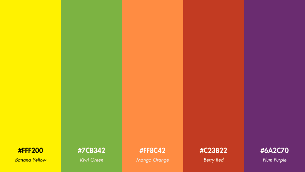
- Banana Yellow: #fff200
- Kiwi Green: #7cb342
- Mango Orange: #ff8c42
- Berry Red: #c23b22
- Plum Purple: #6a2c70
Usage Tips: Great for projects related to food and beverages, particularly in settings that need to evoke freshness, youth, and energy.
Palette 6: Bird of Paradise
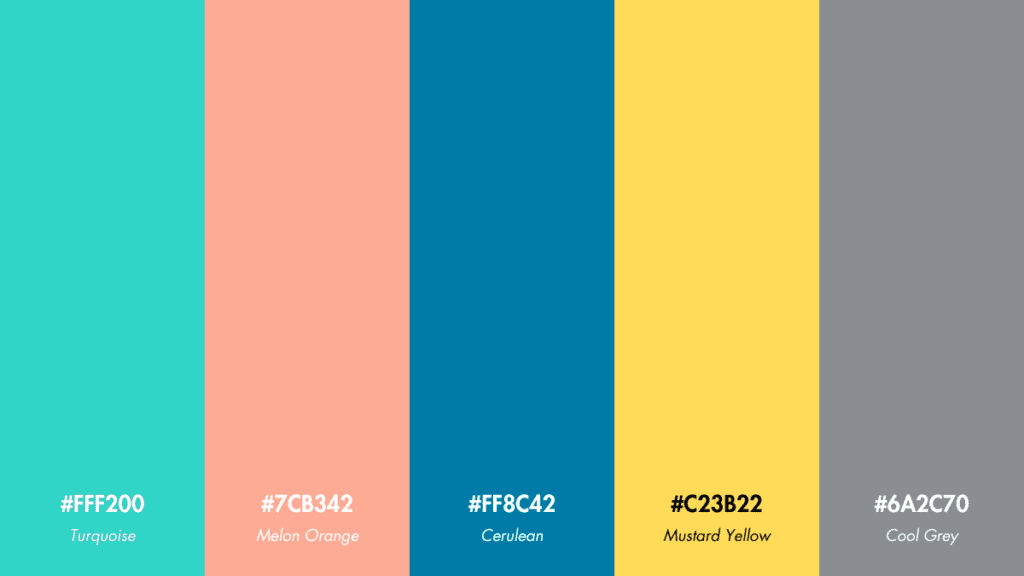
- Turquoise: #30d5c8
- Melon Orange: #feab96
- Cerulean: #007ba7
- Mustard Yellow: #ffdb58
- Cool Grey: #8a8d91
Usage Tips: This unique mix of colors is excellent for creative projects that aim to stand out with a stylish and modern look, such as innovative tech startups or trendy apparel lines.
Palette 7: Tropical Sunset
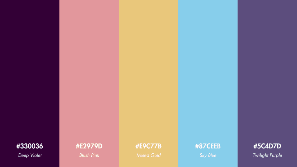
- Deep Violet: #330036
- Blush Pink: #e2979c
- Muted Gold: #e9c77b
- Sky Blue: #87ceeb
- Twilight Purple: #5c4d7d
Usage Tips: Ideal for projects that need a blend of warmth and tranquility, such as evening event invitations or luxury travel brochures.
Palette 8: Rainforest Canopy
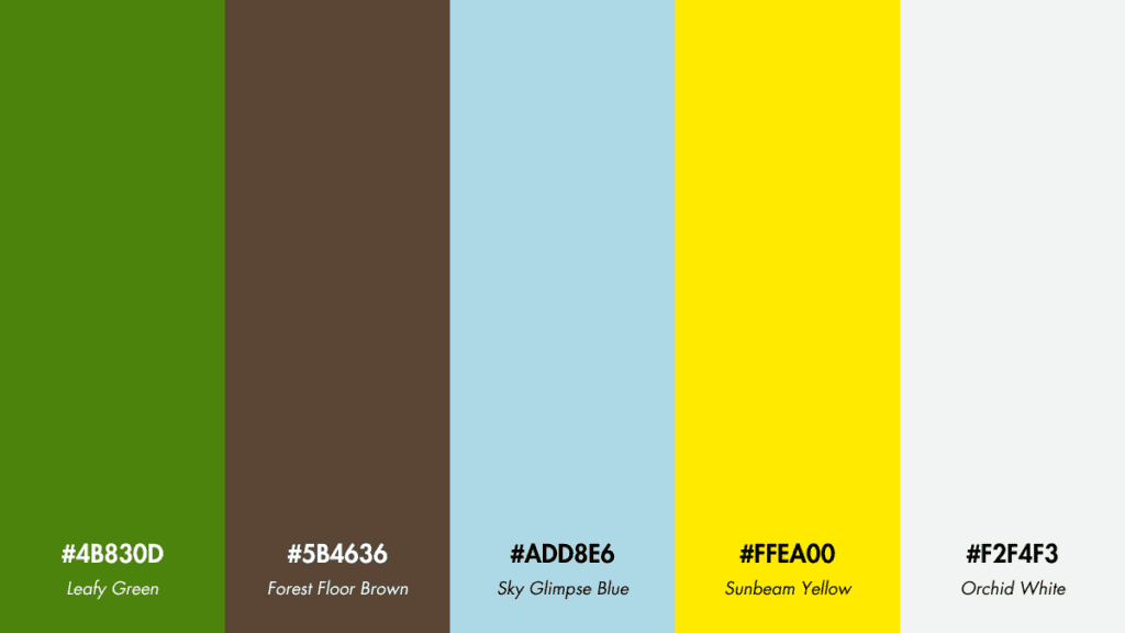
- Leafy Green: #4b830d
- Forest Floor Brown: #5b4636
- Sky Glimpse Blue: #add8e6
- Sunbeam Yellow: #ffea00
- Orchid White: #f2f4f3
Usage Tips: Use this palette for eco-friendly branding or projects that focus on outdoor and environmental themes.
Palette 9: Tropical Waters
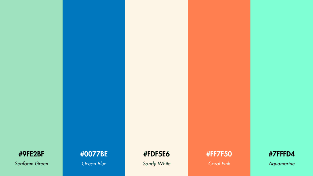
- Seafoam Green: #9fe2bf
- Ocean Blue: #0077be
- Sandy White: #fdf5e6
- Coral Pink: #ff7f50
- Aquamarine: #7fffd4
Usage Tips: Perfect for designs related to water sports, holiday resorts, or any content that aims to evoke the refreshing feel of tropical waters.
Palette 10: Exotic Spices
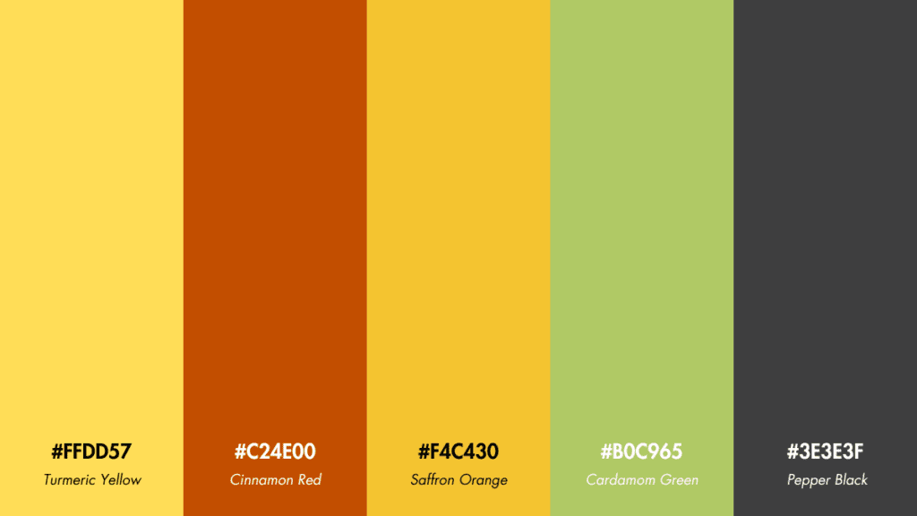
- Turmeric Yellow: #ffdd57
- Cinnamon Red: #c24e00
- Saffron Orange: #f4c430
- Cardamom Green: #b0c965
- Pepper Black: #3e3e3f
Usage Tips: Suitable for culinary or restaurant branding, especially when wanting to highlight exotic and flavorful offerings.
Palette 11: Tropical Night
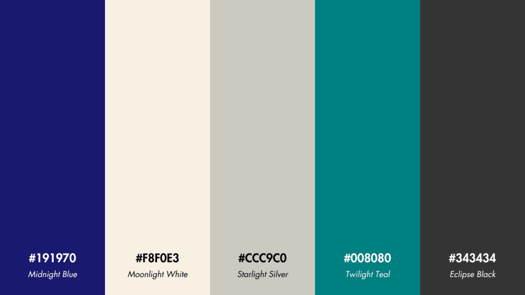
- Midnight Blue: #191970
- Moonlight White: #f8f0e3
- Starlight Silver: #ccc9c0
- Twilight Teal: #008080
- Eclipse Black: #343434
Usage Tips: Great tropical color palette for sophisticated, high-end products or services, giving a sense of mystery and luxury.
Palette 12: Beach Holiday
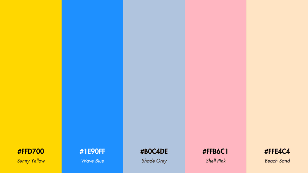
- Sunny Yellow: #ffd700
- Wave Blue: #1e90ff
- Shade Grey: #b0c4de
- Shell Pink: #ffb6c1
- Beach Sand: #ffe4c4
Usage Tips: Use this palette for marketing beachside properties, summer collections, or travel-related promotions that need a cheerful, inviting vibe.
Using Tropical Color Palettes in Your Designs
Implementing these tropical color palettes requires more than just selecting beautiful colors; it involves thoughtful application and a clear understanding of the project’s goal and audience.
- Contrast and Balance: Use contrasting colors for text and background to ensure readability. For designers keen on perfecting this, a high-quality graphic tablet like the Wacom Intuos Pro can provide the precision needed for detailed color work.
- Focus on Mood: Choose a palette that aligns with the mood or emotion you want to evoke. Incorporate mood boards and color guides, such as the Pantone Color Bridge Guide, to make informed choices that resonate with your project’s themes.
- Experiment with Saturation: Mixing saturated and desaturated hues can lead to a more balanced and harmonious look. Tools like Adobe Photoshop offer advanced color editing features that let you fine-tune saturation levels with ease.
Conclusion
In the world of graphic design, the power of color is undeniable. Tropical color palettes, in particular, stand as a testament to the vibrant, energetic, and emotive possibilities that color can bring to creative work. These palettes, rich with hues inspired by nature’s most exotic landscapes, provide designers with a visual vocabulary that can turn the ordinary into the extraordinary.
With the knowledge of color theory and an eye for balance and harmony, the use of a tropical color palette can elevate a design from simply attractive to truly captivating. It’s about more than aesthetics; it’s about conveying a message, evoking a feeling, and creating an experience that resonates with viewers. Whether it’s the zestful lime greens that bring to mind the freshness of new growth or the deep ocean blues that speak of the vastness and mystery of the sea, each color within a tropical palette tells a story.
And as the digital realm continues to expand, the demand for distinctive and impactful design only grows stronger. In such a competitive market, the thoughtful application of a tropical color palette could be what sets a designer’s work apart. It’s an opportunity to be bold, to be innovative, and to let the colors of the tropics inspire designs that are as wild and free as the landscapes they’re derived from.
