Introduction
In the world of visual content creation, color palettes play a crucial role in setting the mood, evoking emotions, and capturing the essence of your message. Among the myriad of color schemes available, sunset color palettes stand out for their ability to infuse vibrant energy and captivating warmth into any design or photograph. In this blog post, we’ll explore seven stunning sunset color palettes that will elevate your visual storytelling to new heights.
The Magic of Sunset Color Schemes
Sunsets have a way of mesmerizing us with their breathtaking display of colors. From fiery oranges to deep purples, these color palettes have the power to transport us to a world of tranquility and awe. When applied to visual content, sunset color schemes can:
- Evoke a sense of warmth and passion
- Create an atmosphere of relaxation and introspection
- Grab the viewer’s attention with their striking combinations
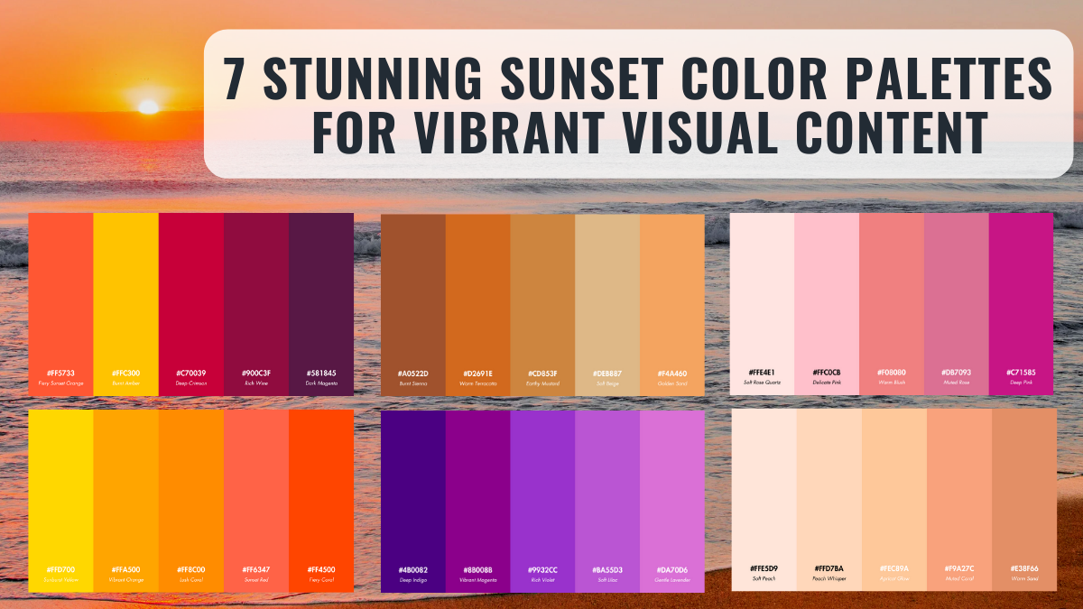
7 Stunning Sunset Color Palettes
Palette 1: Blazing Amber
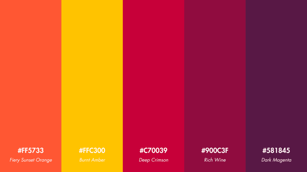
- Fiery Sunset Orange: #FF5733
- Burnt Amber: #FFC300
- Deep Crimson: #C70039
- Rich Wine: #900C3F
- Dark Magenta: #581845
Usage Tips: Perfect for designs that aim to capture attention with a bold and dynamic look. Ideal for adventurous brands and vibrant social media content.
Palette 2: Pastel Paradise
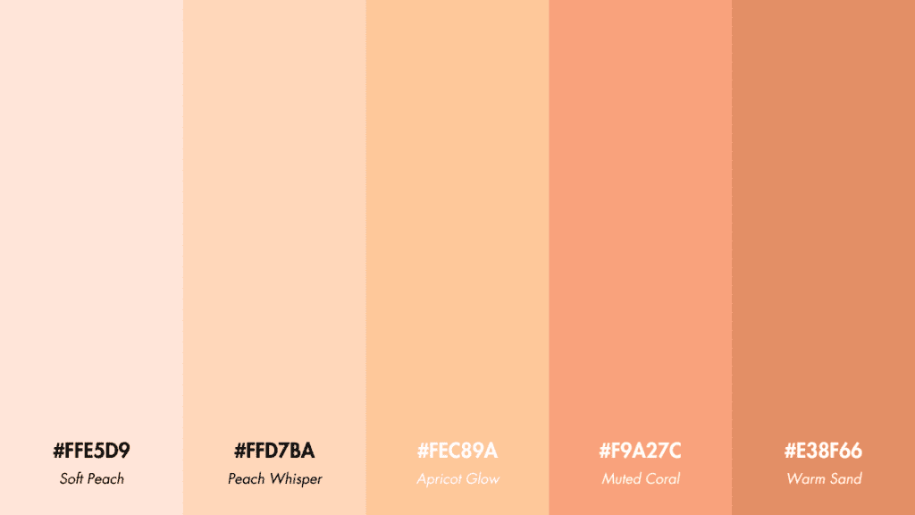
- Soft Peach: #FFE5D9
- Peach Whisper: #FFD7BA
- Apricot Glow: #FEC89A
- Muted Coral: #F9A27C
- Warm Sand: #E38F66
Usage Tips: Creates a soothing and tranquil ambiance, great for wellness brands, beauty products, and any design aiming for a soft, calming effect.
Palette 3: Golden Glow
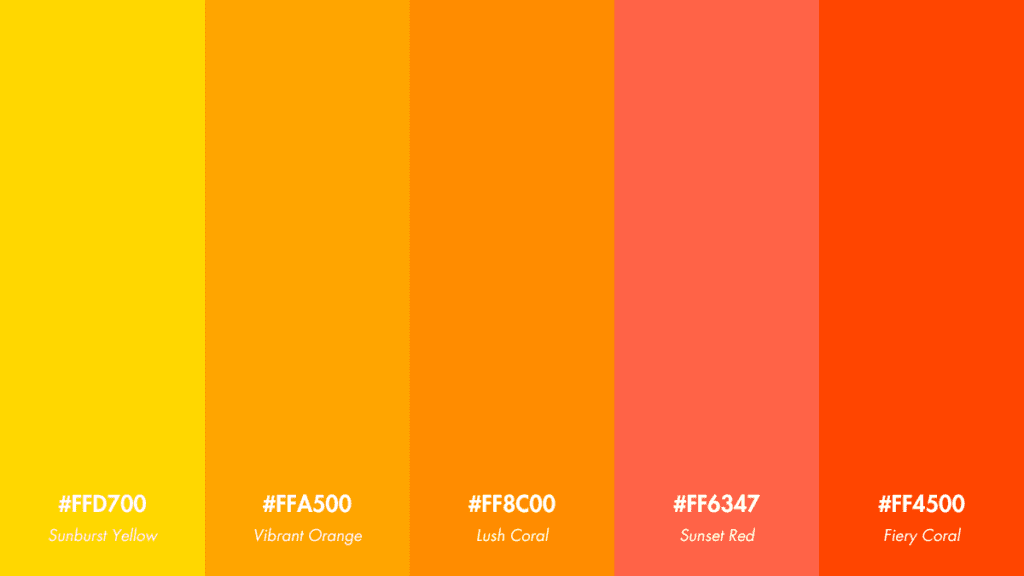
- Sunburst Yellow: #FFD700
- Vibrant Orange: #FFA500
- Lush Coral: #FF8C00
- Sunset Red: #FF6347
- Fiery Coral: #FF4500
Usage Tips: Captures the essence of energy and positivity. Excellent for invigorating marketing campaigns and lively design projects.
Palette 4: Enigmatic Purples
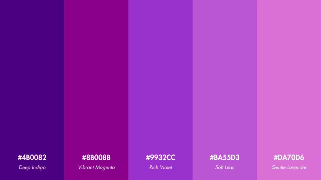
- Deep Indigo: #4B0082
- Vibrant Magenta: #8B008B
- Rich Violet: #9932CC
- Soft Lilac: #BA55D3
- Gentle Lavender: #DA70D6
Usage Tips: Brings a mysterious and luxurious feel to visual projects. Suitable for innovative tech companies or any brand aiming for a bold, imaginative look.
Palette 5: Caribbean Sunset
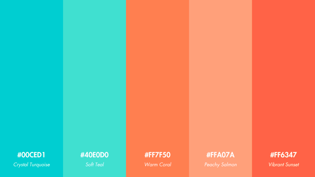
- Crystal Turquoise: #00CED1
- Soft Teal: #40E0D0
- Warm Coral: #FF7F50
- Peachy Salmon: #FFA07A
- Vibrant Sunset: #FF6347
Usage Tips: Evokes the beauty and vibrancy of tropical destinations. Ideal for travel and leisure brands or any project that seeks to inspire joy and wanderlust.
Palette 6: Rose Quartz Blush
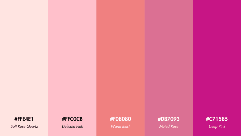
- Soft Rose Quartz: #FFE4E1
- Delicate Pink: #FFC0CB
- Warm Blush: #F08080
- Muted Rose: #DB7093
- Deep Pink: #C71585
Usage Tips: Perfect for creating a romantic and feminine aesthetic. Great for beauty and fashion industries, as well as wedding and event branding.
Palette 7: Rustic Warmth
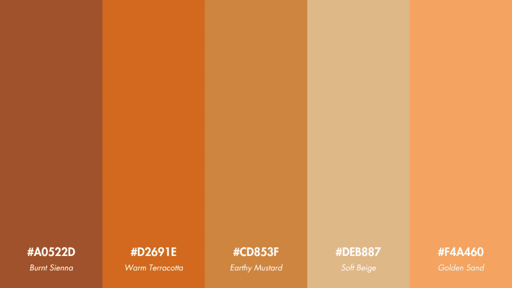
- Burnt Sienna: #A0522D
- Warm Terracotta: #D2691E
- Earthy Mustard: #CD853F
- Soft Beige: #DEB887
- Golden Sand: #F4A460
Usage Tips: Ideal for autumnal themes, cozy interior designs, and brands that want to evoke a sense of comfort and warmth.
Capturing and Incorporating Sunset Colors
To make the most of these stunning sunset color palettes, consider the following tips:
- Photography: Experiment with different angles, exposures, and filters to capture the essence of a sunset in your photographs. Golden hour, the period just before sunset, is an ideal time to shoot.
- Graphic Design: Use sunset color palettes as a starting point for your designs, and pair them with complementary colors or textures to create depth and visual interest.
- Branding: Incorporate sunset colors into your brand identity to evoke a sense of warmth, passion, and creativity. Consistently using these colors across your visual content will help establish a strong and recognizable brand presence.
Case Studies: Brands Embracing Sunset Color Palettes
Several brands have successfully incorporated sunset color palettes into their visual content strategies, creating memorable and impactful campaigns:
- Adobe: Their “Make It With Creative Cloud” campaign featured vibrant sunset hues, showcasing the creative potential of their software suite.
- National Geographic: Known for their stunning photography, National Geographic often highlights breathtaking sunset images across their social media channels, captivating their audience with the beauty of nature.
Conclusion
Sunset color palettes offer a wealth of possibilities for content creators and graphic designers seeking to infuse their work with warmth, energy, and emotion. By exploring these seven stunning palettes and incorporating them into your visual content strategy, you can create designs that leave a lasting impression on your audience.
We’d love to see how you’ve used sunset color palettes in your own creative projects! Share your experiences and examples in the comments below, and don’t forget to follow our blog for more content creation tips and inspiration.
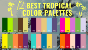
If you’re inspired by the idea of expanding beyond sunset color palettes and exploring vibrant, tropical themes, our article on the 12 Best Tropical Color Palettes offers an exciting continuation of your color exploration journey. Just as sunset palettes capture the breathtaking moments of dusk, tropical palettes embody the lush, vivid, and dynamic hues of paradise islands. Enhance your designs further by incorporating these unique and refreshing tropical color combinations.
FAQ
What are the 6 colors of the sunset palette?
A typical sunset palette includes shades of red, orange, yellow, pink, purple, and blue. However, the exact hues can vary depending on factors such as location, weather conditions, and time of day.
What are the best colors for a sunset?
The best colors for a sunset are warm hues like red, orange, and yellow, often accompanied by cooler shades like pink, purple, and blue. These colors work together to create a striking and visually appealing contrast.
What is the color sequence for sunset?
As the sun sets, the sky typically transitions from lighter to darker colors. The sequence often begins with pale blue, followed by yellow, orange, red, pink, and finally, shades of purple and dark blue.
What are the colors of sunset?
Sunsets can display a wide range of colors, including red, orange, yellow, pink, purple, and blue. The exact colors and their intensity can vary based on factors such as atmospheric conditions, pollution levels, and the sun’s position in the sky.